Robert Hodgins: Graphics

  • THE MARKET

    In recent years, much has been said about the softening of the market for Robert Hodgins' art. This trend is evident in data from Mutual Art, showing that the average price for his works dropped from around $25,000 in 2016 to about $3,500 by 2024.
     
    This variation is testimony to the vagaries of the art market. A market which rises and falls like any other. At the turn of the century paying millions of rands for a painting by Robert Hodgins may have been inconceivable, as was the reaction when the first painting by a South Africa artist (JH Pierneef, Extensive Landscape Northern Transvaal, 1949, in this instance) surpassed the R100,000 mark, selling for R120,000 in 1985. This was only exceeded six years later when a painting by Gerard Sekoto, Six Pence a Door, 1947, achieved R186,000 at auction, and Irma Stern's Still Life of Delphiniums became the first painting to surpass the R200,000 mark, in 1995. That is only 30 years ago. And today, the same paintings would likely achieve more than R20m each.
     
    Art dealer and curator Warren Siebrits highlights Hodgins' remarkable rise in prestige and value after retiring from teaching at age 63 to paint full-time. He notes that in 2002, a major Hodgins painting from the Goodman Gallery could be purchased for less than R40,000. In contrast, Hodgins' record sale-R2.5 million for the 1995 painting J'Accuse, which addresses the infamous Dreyfus Affair-reflects the growing recognition of his historical importance.
     
    Siebrits critiques the South African art-collecting establishment for its traditional focus on oil paintings, often neglecting works on paper. Prints and drawings, he argues, remain under-appreciated and misunderstood, with Hodgins' works on paper being no exception.
     
    During his tenure as art advisor for the Gencor Collection (later the BHP Billiton and South 32 Art Collections), Siebrits oversaw the acquisition of over 600 contemporary artworks for less than R2 million. This included 80 works by William Kentridge and 30 by Hodgins, amongst others. By 2012, Siebrits observed that the collection, amassed during a period of economic and political uncertainty in the mid-1990s, had become nearly irreplaceable in quality and value.
     
    Similarly, the art market of 2024, characterised by low growth, and epitomised by events such as an 88% decline in Sotheby's core earnings and a 25% drop in auction sales (as reported by the Financial Times), mirrors the difficult conditions of the mid-1990s. Indeed, creating a strong buyer's market with foreseeable gains likely to be similar to those experienced by Gencor.
  • THE ARTWORK

    In his 2002 article Undiscovered at 82, Kendell Geers noted the irony of Hodgins' satirical portrayals of businessmen in stuffed suits-figures resembling the very people who purchased his works as investments, seemingly unaware of their implication as subjects.
     
    Geers highlights how Hodgins consistently focused on the human figure, particularly the metaphorical character of Alfred Jarry's Père Ubu-a pathetic, tyrannical, and comical figure lost in his delusional kingdom. For Hodgins, Ubu represented the darker aspects of human nature, embodying themes of power, greed, and absurdity.
     
    Michael Godby similarly emphasises Hodgins' use of Ubu as a personification of maniacal and malevolent power. Ubu appears across Hodgins' oeuvre as a general, lawyer, politician, interrogator, and patriarch, serving as both witness and emblem of evil in historical and fictional contexts.
     
    Through Hodgins' lens, Ubu becomes a proxy for humanity's flaws, present in varying degrees throughout his works. As Geers succinctly puts it, Hodgins approached these subjects "with Hogarth's satirical eye and Monty Python's humour."
  • Attorney-at-Law (1986) is a hand-coloured etching that reveals Robert Hodgins' satirical and acerbic wit. Created during apartheid-era South Africa, it...

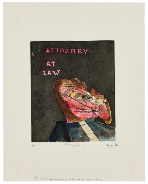
    Robert Hodgins, Attorney-at-Law, 1986

    Attorney-at-Law (1986) is a hand-coloured etching that reveals Robert Hodgins' satirical and acerbic wit. Created during apartheid-era South Africa, it serves as a social critique, addressing themes of authority, corruption, and the absurdities of power. Hodgins often portrayed authority figures as grotesque and morally compromised, and this work aligns with his broader commentary on societal hierarchies, particularly those complicit in apartheid. The title, referencing legal power, contrasts sharply with the figure's distorted head rendered in vivid pinks and yellows, evoking decay, inner turmoil, and corruption. A dark, textured background isolates the figure, emphasising its alienation, while the bold pink text, "ATTORNEY AT LAW," underscores the disparity between presumed prestige and grotesque reality.
     
    Through grotesque realism, Attorney-at-Law critiques institutional authority, exposing themes of moral decay and hypocrisy. The chaotic colours and distorted imagery reflect the complicity of the legal profession in enforcing systemic oppression during apartheid.
     
    This etching was produced at The Caversham Press, South Africa's first fine art collaborative printmaking studio, under the guidance of master printmaker Malcolm Christian. Known for its commitment to traditional hand-printing methods, the press rejected mass-production techniques, prioritising quality and supporting both established and emerging artists during a time of limited resources.
     
    The hand-colouring personalises each print, making it unique within the edition. Hodgins' blend of traditional printmaking with painterly techniques is emphasised by the inscription, "This hand-colouring unique to this print," alluding to the individuality of this work.


    More

  • Medal (1987), a hand-coloured lithograph, critiques power, hierarchy, and identity through Robert Hodgins' signature blend of humour and abstraction. Created...

    Robert Hodgins, Medal, 1987

    Medal (1987), a hand-coloured lithograph, critiques power, hierarchy, and identity through Robert Hodgins' signature blend of humour and abstraction. Created during apartheid-era South Africa, it reflects the sociopolitical turbulence of the 1980s, a period that deeply informed Hodgins' critical exploration of authority, bureaucracy, and societal structures.


    Produced at The Caversham Press under the guidance of master printmaker Malcolm Christian, Medal aligns with Hodgins' broader examination of institutional power and its symbols. While the titular medal suggests prestige and achievement, the fragmented imagery and layered motifs subvert these notions, exposing the vanity and fragility of such symbols. Hodgins mocks the arbitrariness of emblems of power, highlighting their emptiness and the systems that bestow them.


    The composition features a central vertical figure rendered lithographically in ink, alongside a hand-painted form resembling a medal. The lower portion, appropriated to represent the medal's pendant, incorporates the silhouette of a uniformed soldier in profile, further emphasising the interplay between power, symbols, and meaning.


    More

  • The Senator from Mississippi (1987) is an etching that critiques authority, identity, and societal structures with Hodgins’ sharp satire. Created...

    Robert Hodgins, The Senator from Mississippi, 1987

    The Senator from Mississippi (1987) is an etching that critiques authority, identity, and societal structures with Hodgins’ sharp satire. Created during apartheid-era South Africa, it reflects systemic corruption and hypocrisy on a global scale. While rooted in South African politics, the reference to a U.S. senator draws parallels between the racial inequality and entrenched power dynamics of apartheid South Africa and the American South.
     
    The pin-striped suit and tie—recurring symbols in his work—represent political and corporate authority, while the distorted, swirling head conveys a loss of identity or integrity. The grotesque abstraction of the senator’s face undermines the traditional dignity of political office, with the reference to Mississippi—a state historically associated with racism and conservatism—reinforcing themes of systemic oppression.
     
    Hodgins juxtaposes precise line work in the suit and tie with chaotic, fluid strokes in the head, highlighting the contrast between external order and internal chaos. The stark black-and-white palette intensifies the severity of the subject, stripping the figure of humanity and focusing attention on its symbolic critique of systemic power. Although referencing a U.S. senator, the work reflects Hodgins’ lived experience of apartheid, placing the senator as a universal stand-in for corrupt leaders worldwide.


    More

  • An English Sphinx (1988/90) is a hand-coloured etching notable for its meticulous detail and technical finesse. Also produced at The...
    Robert Hodgins, An English Sphinx, 1988/90

    An English Sphinx (1988/90) is a hand-coloured etching notable for its meticulous detail and technical finesse. Also produced at The Caversham Press under the guidance of Malcolm Christian, the print depicts the profile of a human head rendered in a simplified, surreal and abstracted style. The face, composed of layered textures and tones, features bold yellow-orange areas contrasted with the stark whiteness of the blank, unprinted surface, that underscore the interplay between human presence and the surrounding landscape. A minimalist composition, this print is complemented by a sun and a small tree in the background, evoking a serene, meditative atmosphere. The intricate internal textures, characterised by lines and scratches, suggest Hodgins' characteristic introspection and musings on memory and identity.
     
    Hodgins' expertise in combining traditional printmaking techniques with painterly elements is again evident in this work. His use of a limited yet vibrant palette reflects his modernist sensibilities and his affinity for simplicity and abstraction. The title, An English Sphinx, invokes notions of enigma and mystery, drawing parallels to the riddles of classical mythology, which he so enjoyed. The work may explore themes of English identity (as Hodgins was himself born in Dulwich, England), cultural memory, and the complexities of human character.


    More

  • These Sundays, triptych (1997/8), is a vibrant work comprising three panels that blend screen-printing and lithography, showcasing Hodgins' mastery of...

    Robert Hodgins, These Sundays, (triptych), 1997/8

    These Sundays, triptych (1997/8), is a vibrant work comprising three panels that blend screen-printing and lithography, showcasing Hodgins' mastery of printmaking. Created in post-apartheid South Africa, the work reflects the contrasting feelings of optimism and uncertainty that characterised the time, and the lingering challenges of that era.
     
    Hodgins captures the banality and poetry of everyday life, with Sundays serving as a metaphor for stillness, routine, and the passage of time. Architectural and landscape elements, such as shops and fuel stations, ground the scenes in specific cultural contexts, highlighting the interplay between isolation and mundane activities. Sparse buildings and wide-open spaces suggest the duality of Sundays as both restful and solitary.
     
    The triptych format creates a fragmented yet interconnected narrative, with each panel standing independently while contributing to the whole. The combination of screen-printing and lithography adds rich textures to the tactile quality of the built environments and the ethereal atmosphere of the open landscapes. Hodgins' balance of detail and abstraction invites personal interpretation and emotional resonance over explicit storytelling.
     
    The ambiguous title, These Sundays, encourages the viewers to reflect on their own experiences and associations. Rooted in the context of post-apartheid South Africa, the work's focus on ordinary scenes conveys universal themes of routine, rest, and time. It may also serve as a metaphor for South Africa's contemplative process of rebuilding and redefining its identity during a time of social change.


    More

  • Produced late in his career, Well, here we are... (2008) is a colour monotype that blends abstraction with figurative elements...

    Robert Hodgins, Well, here we are..., 2008

    Produced late in his career, Well, here we are... (2008) is a colour monotype that blends abstraction with figurative elements to explore themes of power, human relationships, and existential reflection. Created near the end of his prolific career in collaboration with The Artists' Press, a renowned South African print studio led by master printer Mark Attwood, the work reflects Hodgins' fascination with spontaneity and individuality. The monotype medium, a single-print technique, requires improvisation and immediacy in making the unique work.
     
    Featuring seated figures in an ambiguous setting, the disconnected postures and the sparse environment convey their vulnerability, and the absurdity of modern social dynamics. The title, Well, here we are..., suggests a resigned or reflective tone, hinting at collective reckoning and our conformity within societal structures.


    More

  • Sources:

    Geers, Kendell (2002), Undiscovered at 82. In Atkinson, Brenda (et al), Robert Hodgins. Cape Town: Tafelberg, pp.62-68.

    Godby, Michael (2002), The Old Man Mad About Painting. In Atkinson, Brenda (et al), Robert Hodgins. Cape Town: Tafelberg, pp.70-78.

    Siebrits, Warren (2012), Confessions of an Art Advisor: Robert Hodgins and the South African Art Market. In Buys, Anthea, A Lasting Impression: The Robert Hodgins Print Archive. Johannesburg: Wits Art Museum, pp.173-191.